Quinnipiac University Redesign
Quinnipiac University Redesign
Quinnipiac University Redesign
Quinnipiac University Redesign
Client —
Quinnipiac University
Hamden, CT
2016
Hamden, CT (2016)
Hamden, CT (2016)
Agency —
Critical Mass
New York, NY &
Calgary, Canada
New York, NY & Calgary, Canada
New York, NY & Calgary, Canada
Background —
To accompany a complete rebranding of the university spearheaded by Pentagram, Critical Mass was tasked with the digital rebrand and redesign of Quinnipiac University's (QU) website. The client needed a design system that was flexible enough to accommodate a wide variety of content including department pages, course descriptions, social content, and much more while being intuitive enough for their in-house team to manage themselves. The site was built on the Adobe Experience Manager (AEM) platform which was relatively new at the kick off of this project.
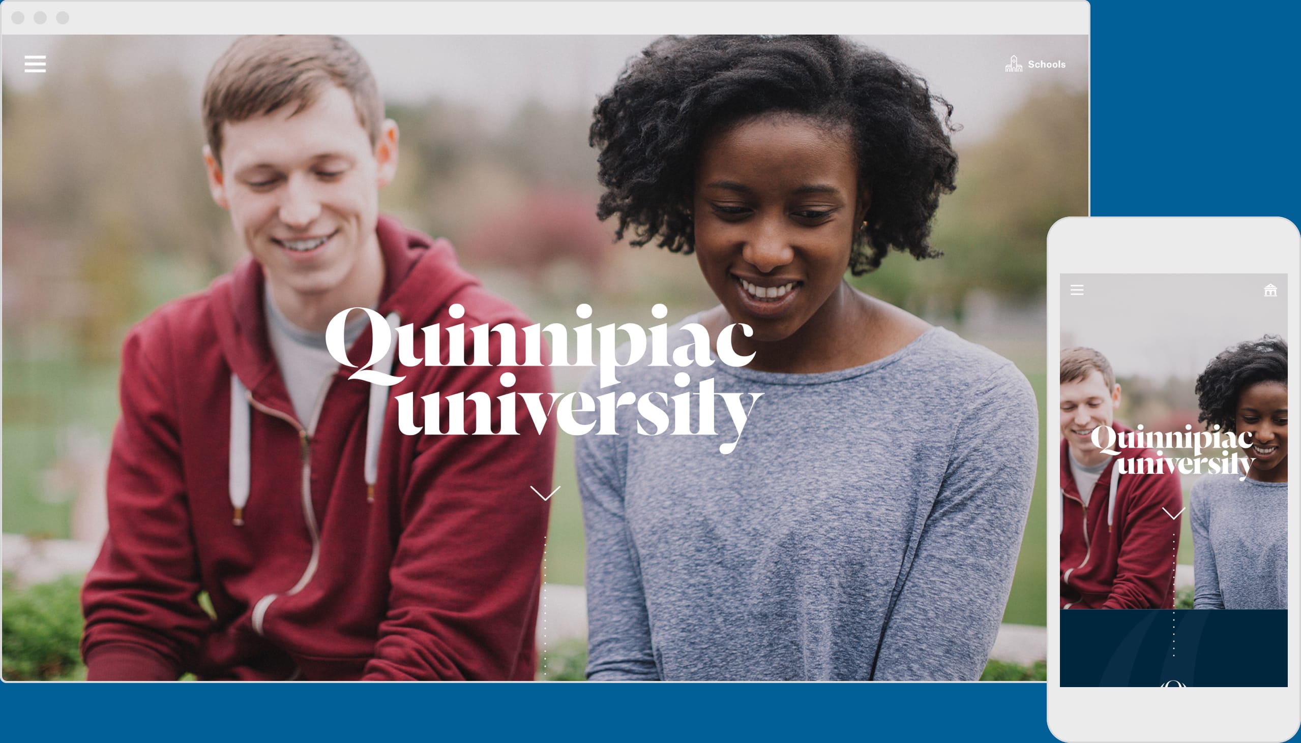
Photography by Rich Gilligan
Photography by Rich Gilligan
Photography by Rich Gilligan
Getting Started
We began our engagement with Quinnipiac University’s marketing department shortly after they enlisted Pentagram for a complete rebrand. We were able to observe Pentagram’s process as they honed in on the eventual direction for rebranding effort. While Pentagram worked on the general applications for the new brand, we focused on its translation into a digital modular system that could be used in the CMS.
As we prepared to redesign QU.edu, our new approach for the content strategy and site architecture departed radically from the traditional approach of most universities. We moved away from a site architecture that matched the institutional structure of the university and toward one that more aligned to our client’s goals of marketing toward prospective undergraduate students.
Quinnipiac Icon by Pentagram
How We Worked
While we knew that we had to design for a modular set of extensible components, we also understood that we had marketing clients that needed to be assured along the way. They needed so see progress and proof that it would amount to something tangible that would align to their vision of a new QU that would appeal to the next generation of students.
We divided our design work into two work streams. The main work stream focused on designing in tandem, both the templates and the components that would make up the bulk of the experience. These were the pages that lived one or two levels below the landing page. They housed much of the practical content such as facilities, degree and course information, departments, etc. The other work stream focused on several custom “glamour” pages, such as the homepage and Quinnipiac Now. These pages for the most part did not make use of the modular design system, but instead were designed as richer, custom experiences. Their intent was to act as a front door for prospective students. While the homepage drew in prospects to provide the first impression that would eventually funnel them deeper into the site, Quinnipiac Now was intended to be a dynamic destination where many aspects of student life were aggregated. Prospects could have glimpse into the rich student culture that might await them if they chose to attend QU.
By simultaneously designing the experience via these two work streams we were able to create space to develop our modular approach while directing our client’s focus to the richer custom pages. Getting buy in for these rich pages eased the way for completing the bulk of our design work on the system.
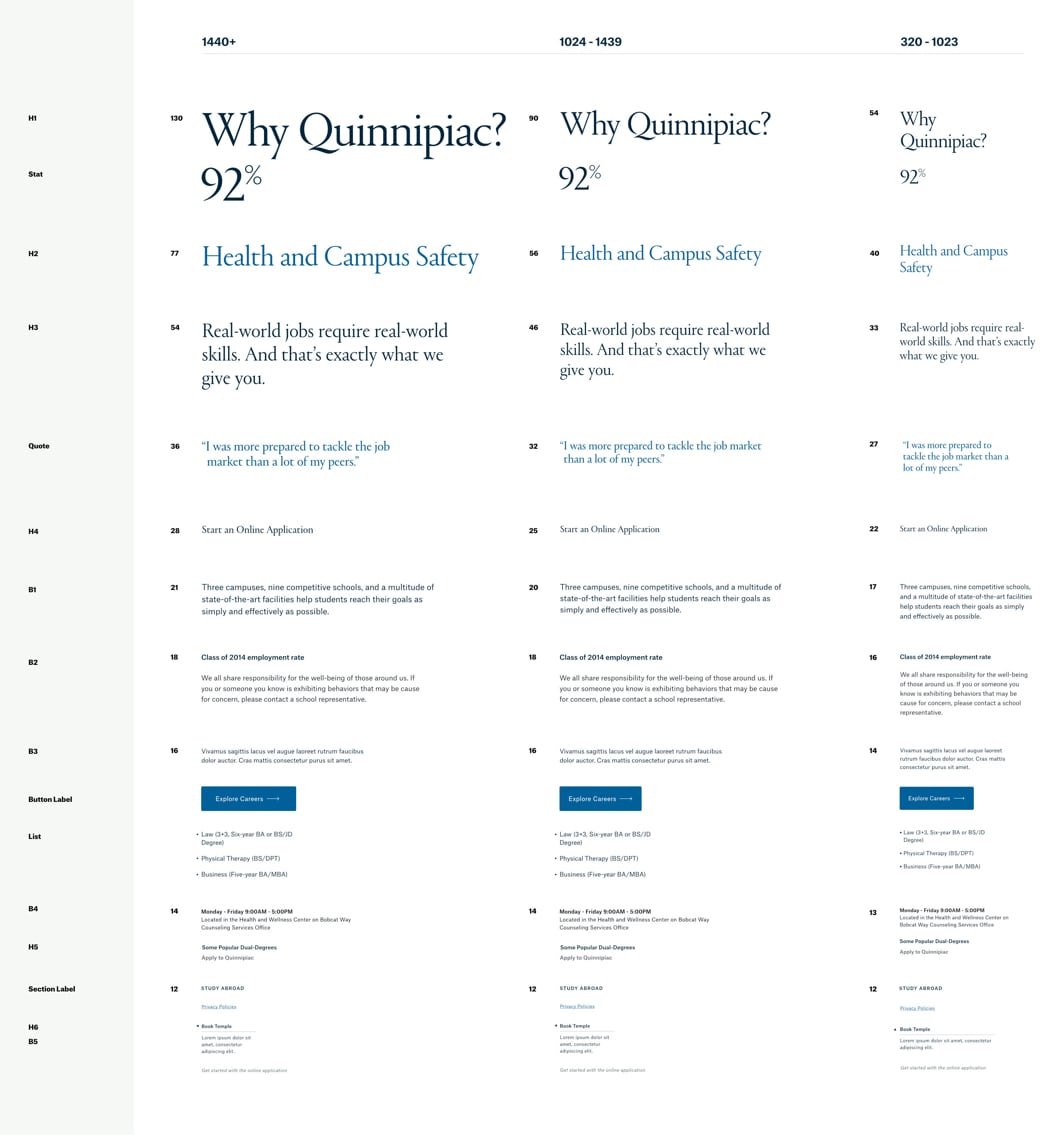
Web Typographic Stack
The AEM Way
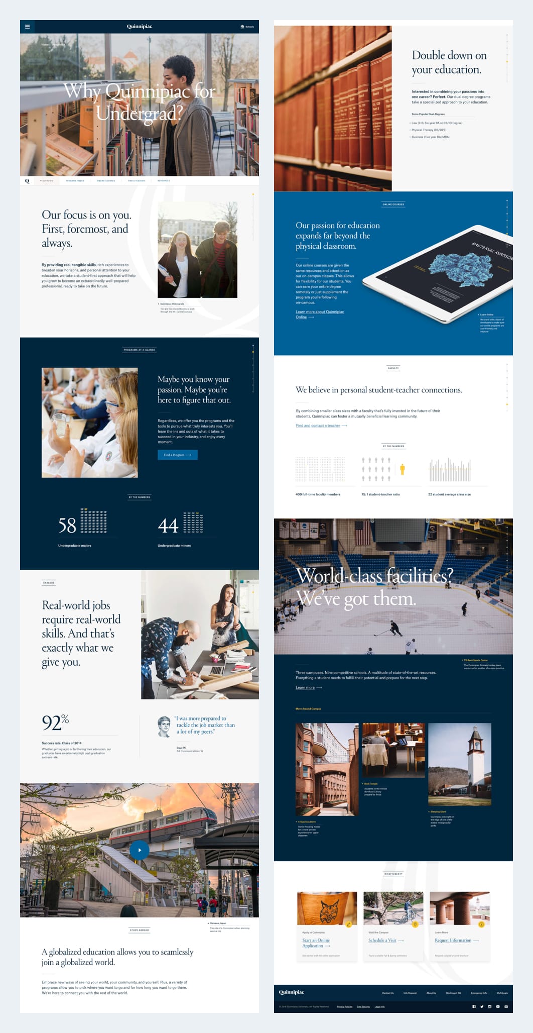
The bulk of the QU site experience is built upon a modular approach using individual components. These components contain a number options to allow for alternate styling, layout, and even the consituent elements that comprise them. Grouping a number of components into sections allow them to inherit color themes which gives longer pages a visual cadence as the user navigates the various content sections.
Sample Landing Page
Assorted Components

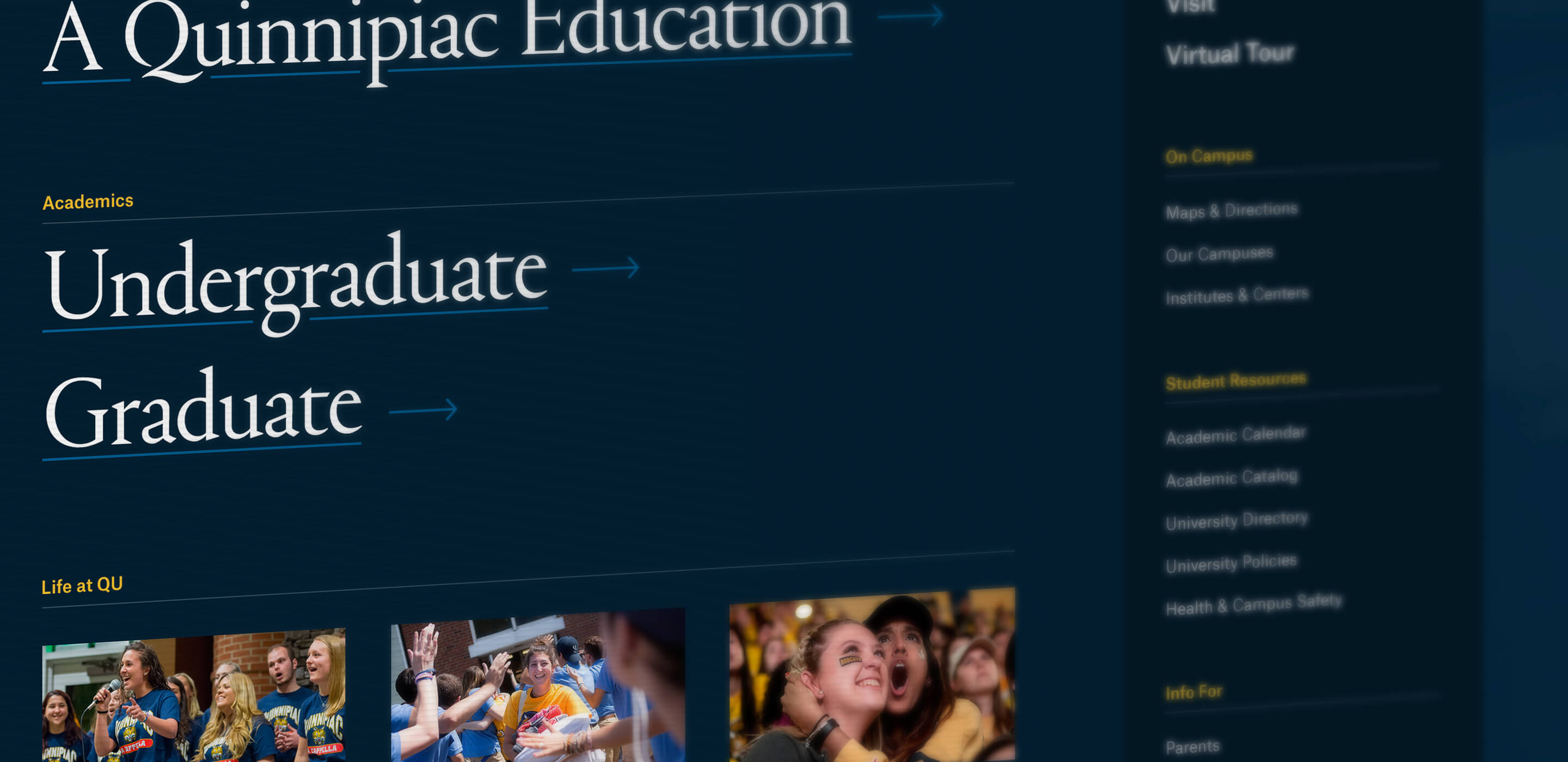
Incredibly Robust Site Navigation
Custom Developed Pages
A small set of pages within the QU site were custom developed outside of the modular design system. These included pages that required specific functionality or an aesthetic quality that was better accomplished through custom development.
The homepage and Quinnipiac Now were the most high touch of our customized pages. While they might not represent the most practical content, they were in their own ways gateways into the experience a prospective student might expect were they to attend QU. As such, we placed a high level of importance on them, allocating a senior designer to tackle each page. These proved to be a particular challenge in getting “right” for our client with continuous revisions running nearly the duration of the engagement.
University Homepage

Quinnipiac Now

Handoff and Training
While we were tasked with developing the design system, the modular components, and a handful of templates and custom pages, our engagement wasn’t truly complete until the site launched.
The original expectation was to hand over the custom pages and the system for authoring the rest of the experience. However, the reality involved significantly more hand holding. The Quinnipiac marketing team underestimated the challenge in using AEM to author the pages for their content. The consequence of their ask for greater variability and customization meant that the task of using the system became significantly more complex. However, we had timing on our side. It was summer, and thus we had a group of interns to assist in the bulk authoring of a number of pages.
In order to both train our interns and our clients, we developed a style guide and an abbreviated curriculum about authoring in AEM. After developing some guidelines and tasking our interns, we embarked to the university for a day of intensive hands on training. We taught the marketing team how to use the CMS to build pages, edit content, and upload media. Thus the new plan was for that team to maintain the content on pages built out by our own team of interns and designers.
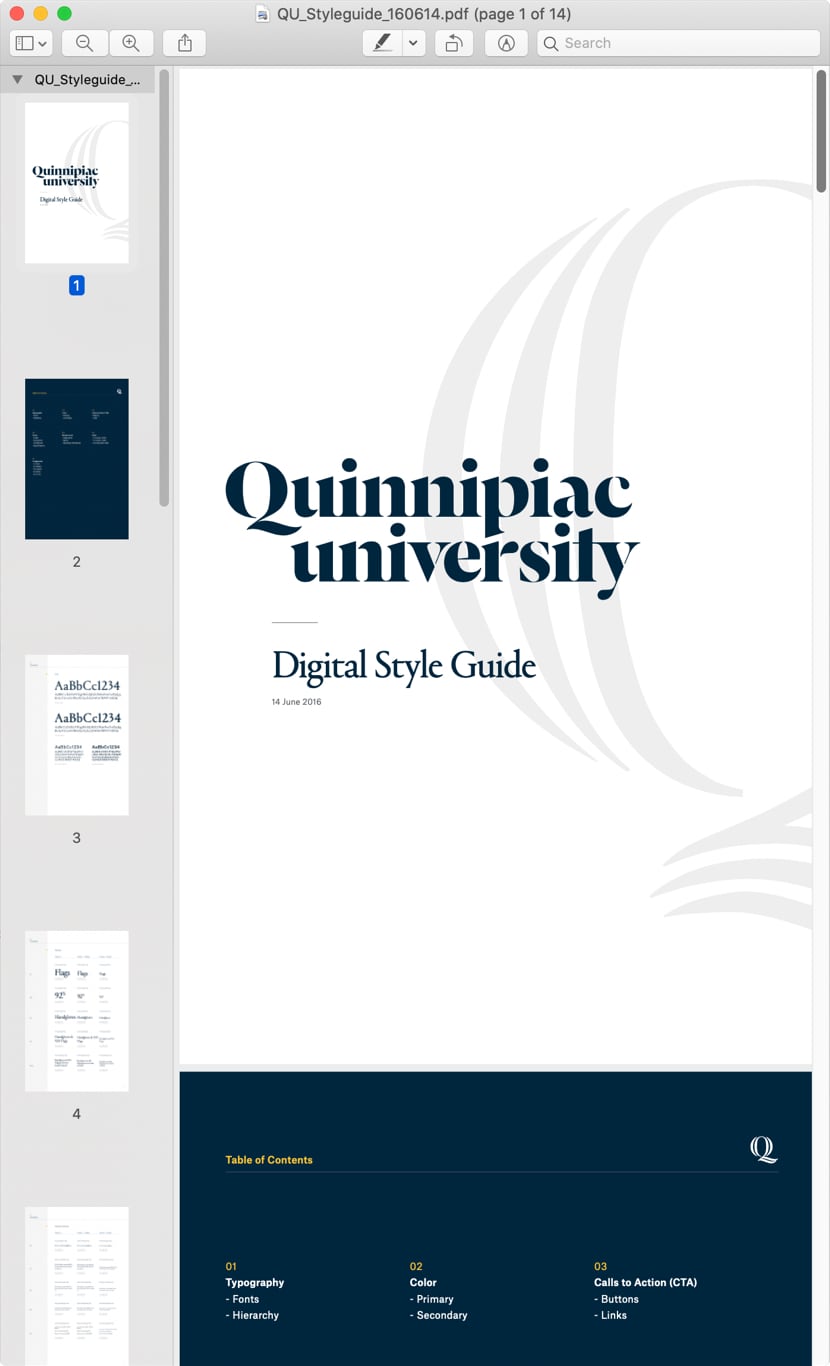
Digital Styleguide as PDF
Accolades
We were pleased to learn that the newly redesigned QU.edu was nominated in the website higher edu category and was designated an honoree for best homepage/welcome page. It’s always nice to see recognition for your work after a challenging project wraps.


Websites
Best Home/Welcome Page 2017
Apps, Mobile, and Voice
School/University 2017


Websites
Best Home/Welcome Page 2017
Apps, Mobile, and Voice
School/University 2017
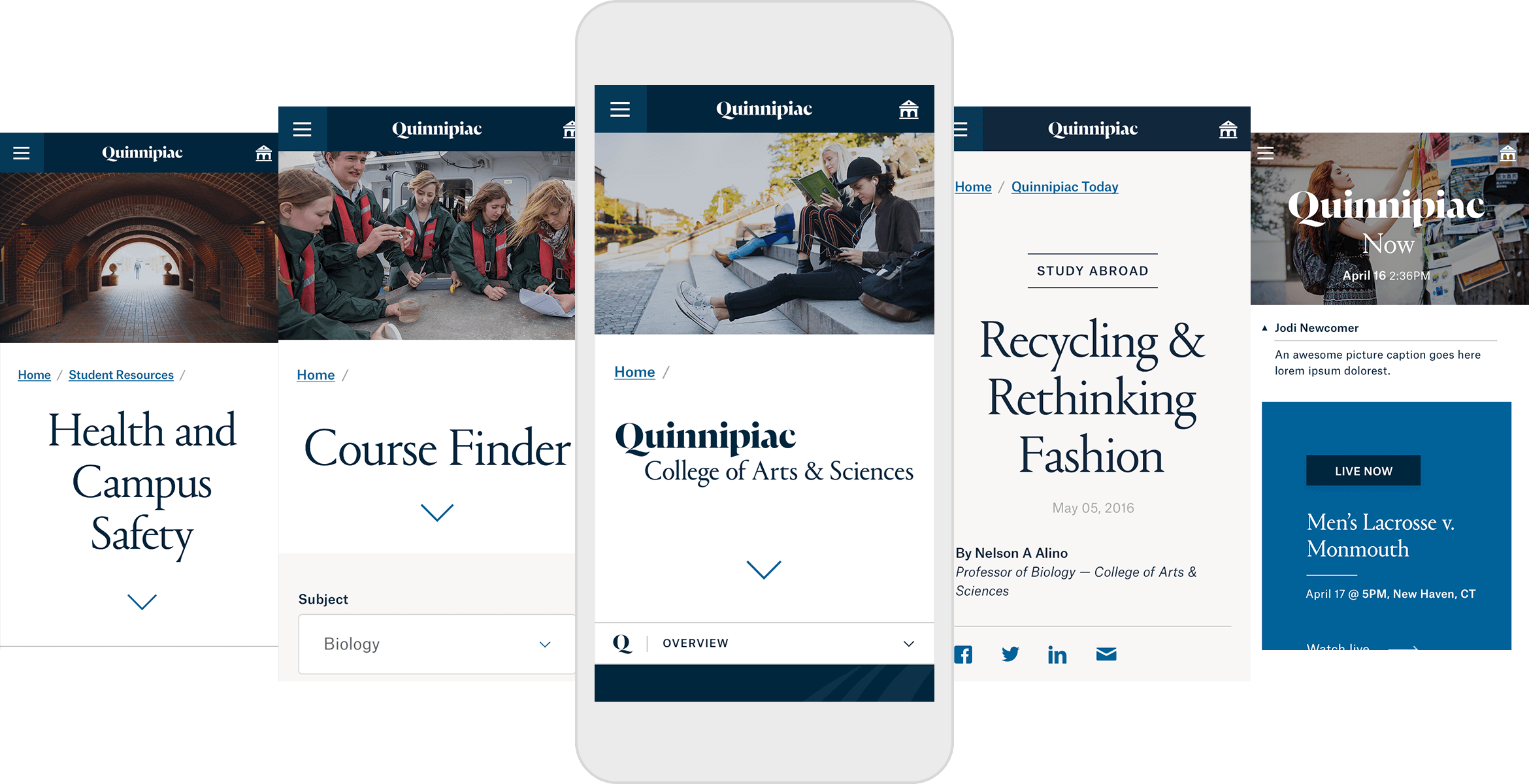
Works on Mobile Too!
© 2023 Will Gabrenya