Citibank Native iOS App
Citibank Native iOS App
Citibank Native iOS App
Citibank Native iOS App
Client —
Citibank
New York, NY
2014-2015
New York, NY (2014-2015)
New York, NY (2014-2015)
Agency —
Critical Mass
New York, NY &
Toronto, Canada
New York, NY & Toronto, Canada
New York, NY & Toronto, Canada
Background —
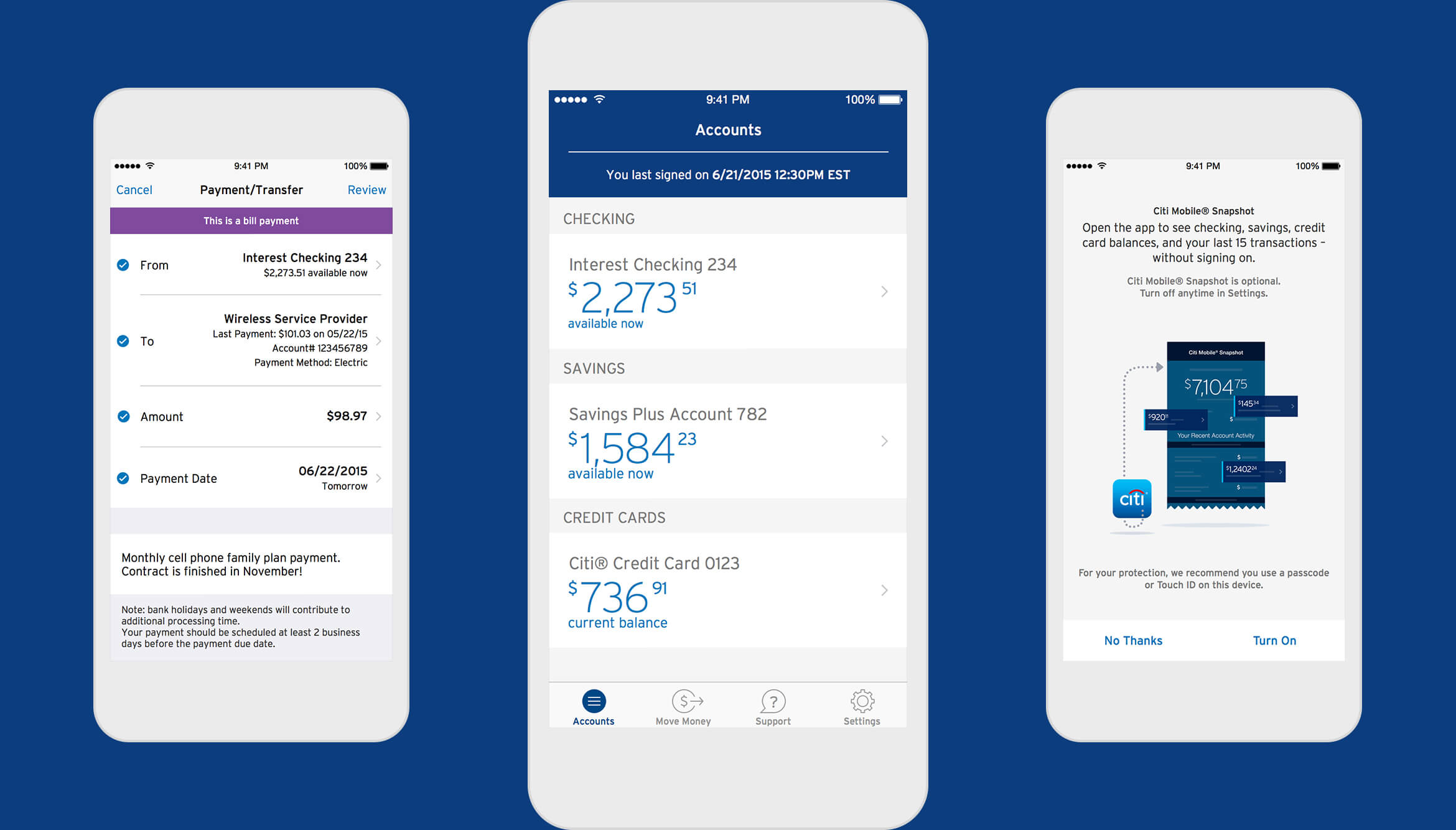
With the announcement of the forthcoming Apple Watch in Fall 2014, Citi was invited by Apple to become a launch partner for their new hardware. To be able to connect with the Apple Watch, Citi had to build a new iOS native app from the ground up. We redesigned the new watch compatible app with the primary goal of making the UI intuitive for iOS users. From kickoff to launch, the app was designed, developed, and tested in 7 months.

Payment/Transfer, Accounts Overview, Snapshot Setup
Payment/Transfer, Accounts Overview, Snapshot Setup
Payment/Transfer, Accounts Overview, Snapshot Setup
An Aggressive Engagement
By most accounts, this undertaking was the first major client engagement for Critical Mass NYC. It was also the project that brought me to Critical Mass and subsequently allowed for growing this office. We initially kicked off the project with a creative team of seven, working at our development partners at IBM’s Astor Place office. We co-located with our Citi clients at IBM’s office from late November of 2014 through early June of 2015, with a brief stint at IBM’s offices in San Jose, CA.
What began as a more or less agile process quickly pivoted to take on a more “agile-fall” style. This required many more formal client reviews and necessitated that our team take on an additional five designers to accommodate the extra process overhead. Rough estimates placed the team running at 130% capacity for much of the engagement. Much credit is due to the entire Critical Mass team for maintaining quality and velocity through the seven month duration of the project, enduring late nights, cross-country travel, stressful multi-agency collaboration, and decidedly non-ergonomic hot-desk stool seating.
An Uncertain Approach
Prior to our engagement on the Citi Mobile app, Citibank client’s were using an PhoneGap app. Essentially a website running inside a native app wrapper. As such, the app was not able to take advantage of certain iOS hardware and software capabilities. Since the initial impetus of the project was to create an app that would launch with the forthcoming Apple Watch, the whole experience needed to be rebuilt from the ground up. Unfortunately, at the time of project kickoff, no one outside of Apple new exactly when the Watch would launch. For all we knew, we had between three and six months to complete the design and development of the app.
Our approach to the design and development of the app was to prioritize the features and mechanisms to necessary to pair and Apple Watch. Thus, we began with the login and sign up experience, followed by the watch pairing functionality and a very nascent account view called Snapshot. As we wrapped on the bare bones version of the app we realized that the earliest window of the Watch launch had come without an announcement. This allowed us to continued to add functionality. We followed with detailed views for credit cards and banking accounts, app preferences, payments and peer-to-peer money transfers, a welcoming flow, and a local offers platform (which wasn’t in the initial launch). The later then expected release of the Apple Watch was a blessing in disguise since it allowed for a more fully featured Citi Mobile app launch.

Credit Card Ledger Flow
Credit Card Ledger Flow
Snapshot
Snapshot allows an account holder to quickly view balances and a limited number of transactions for their accounts without needing to log on. The Snapshot view of a user's accounts can either load automatically upon opening the app or appear on a swipe from the log on screen.
Snapshot Overview, Credit Card Snapshot


Account Ledger
The majority of a user's experience will take place on the account ledger. It provides an overview of the account, but also allows the user to dive deeper into the account's details and transaction activity and perform certain actions such as paying a bill.
Credit Card Ledger, Card Ledger Expanded View, Bank Ledger
Credit Card Ledger, Card Ledger Expanded View, Bank Ledger
Credit Card Ledger, Card Ledger Expanded View, Bank Ledger


iOS App Icon Directions
Outcome and Legacy
After a grueling seven month grind we launched Citibank’s first native iOS app. We almost couldn’t believe the reception. Despite being the “version 1.0” of the app, we saw an immediate impact to its App Store rating. The old PhoneGap version of the app was rated around 2 stars. Upon the launch of our app, the rating soared to around 4.5 stars.
The success of the launch allowed for the expansion of the Citibank account for Critical Mass, which saw the NYC office double from around 25 to 50 employees by the end of 2015. By 2017 the Citibank account team in NYC would grow to around 25 employees working on not only the mobile app but sundry other projects for Citibank.

Ratings Success
Welcome Experience


© 2023 Will Gabrenya